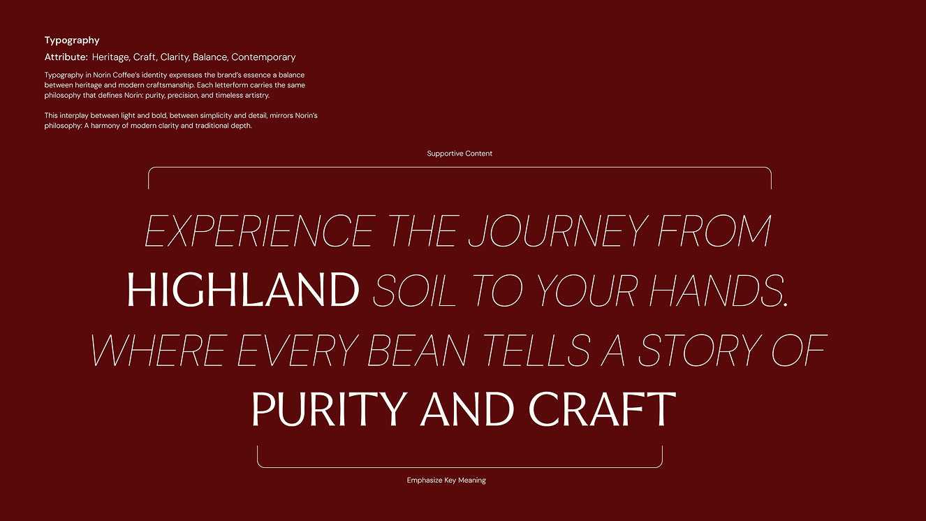
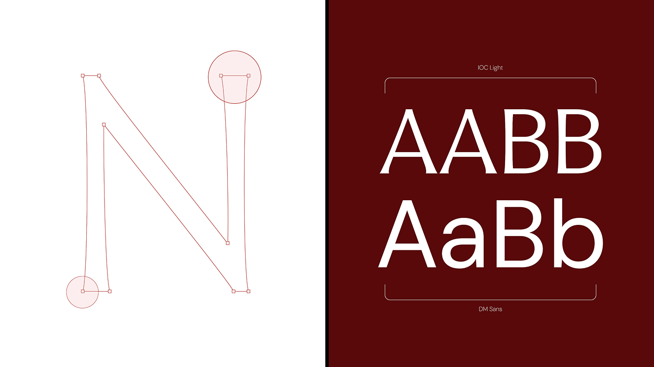
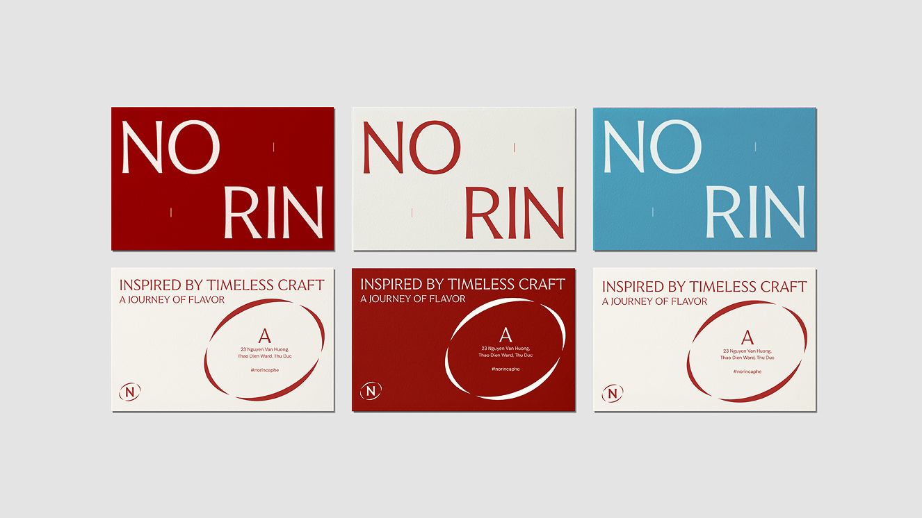
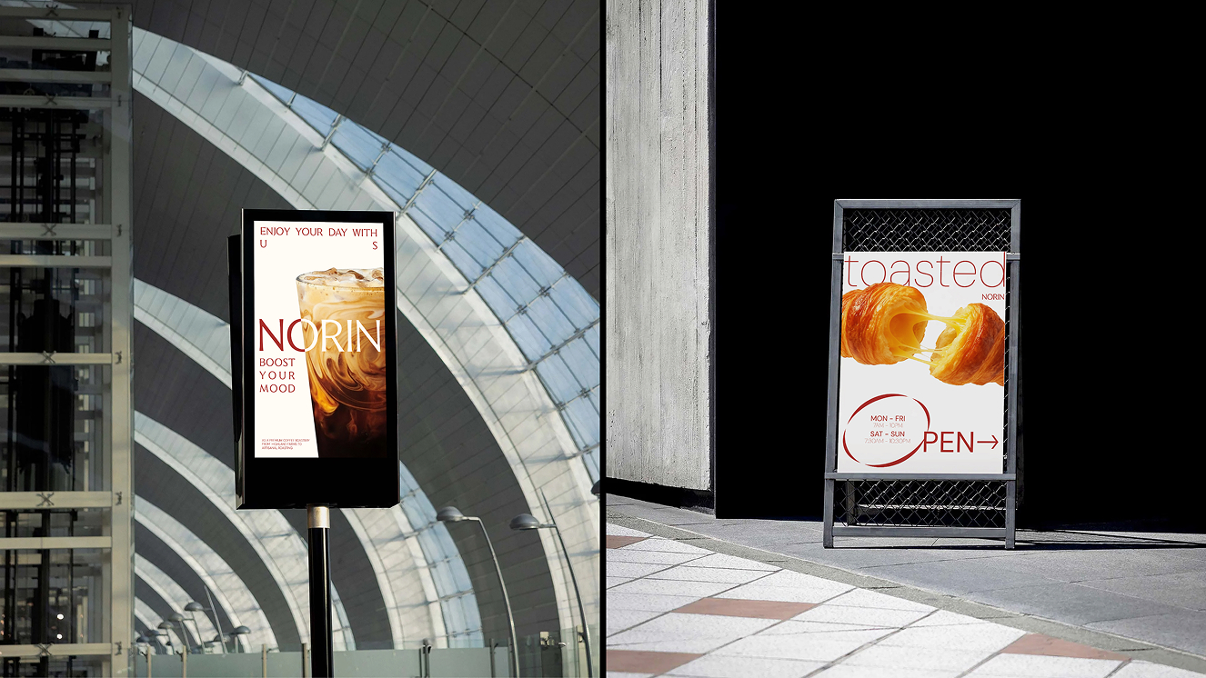
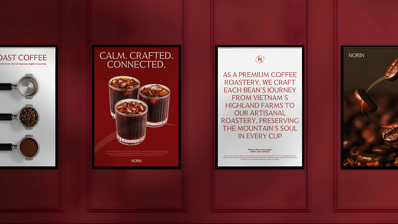
The typeface used in Norin Coffee’s visual identity is carefully selected to balance modern simplicity with a warm, approachable character. Clean letterforms and well-proportioned spacing create a sense of clarity and readability, allowing the brand to communicate confidently across different touchpoints.
The typography system emphasizes minimalism while maintaining a distinctive personality, helping the brand feel contemporary yet inviting. Its versatility ensures consistency across packaging and marketing materials, reinforcing a cohesive visual language that reflects Norin Coffee’s refined and friendly brand spirit.